This tutorial will integrate a few most popular technical indicators into our Bitcoin trading bot to learn even better decisions while making automated trades in the market.
In my previous tutorials, we already created a python custom Environment to trade Bitcoin; we wrote a Reinforcement Learning agent to do so. Also, we tested three different architectures (Dense, CNN, LSTM) and compared their performance, training durations, and tested their profitability. So I thought, if we can create a trading bot making some profitable trades just from Price Action, maybe we can use indicators to improve our bot accuracy and profitability by integrating indicators? Let's do this! I thought that probably there are no traders or investors who would be making blind trades without doing some technical or fundamental analysis; more or less, everyone uses technical indicators.
First of all, we will be adding five widely known and used technical indicators to our data set. The technical indicators should add some relevant information to our data set, which can be complimented well by the forecasted information from our prediction model. This combination of indicators ought to give a pleasant balance of practical observations for our model to find out from:
 I am going to cover each of the above given technical indicators shortly. To implement them, we'll use an already prepared ta Python library used to calculate a batch of indicators. If we succeed with these indicators with our RL Bitcoin trading agent, maybe we'll try more of them in the future.
Moving Average (MA)
The MA - or 'simple moving average' (SMA) - is an indicator accustomed to determining the direction of a current market trend while not interfering with shorter-term market spikes. The moving average indicator combines market points of a selected instrument over a particular timeframe. It divides it by the number of timeframe points to present us the direction of a trend line.
The data used depends on the length of the MA. For instance, a two hundred MA needs 200 days of historical information. By exploiting the MA indicator, you'll be able to study support and resistance levels and see previous price action (the history of the market). This implies you'll be able to determine possible future price patterns.
I wrote the following function that we'll use to plot our indicators with OHCL bars and Matplotlib:
import matplotlib.pyplot as plt
from mplfinance.original_flavor import candlestick_ohlc
import matplotlib.dates as mpl_dates

def Plot_OHCL(df):
    df_original = df.copy()
    # necessary convert to datetime
    df["Date"] = pd.to_datetime(df.Date)
    df["Date"] = df["Date"].apply(mpl_dates.date2num)

    df = df[['Date', 'Open', 'High', 'Low', 'Close', 'Volume']]

    # We are using the style ‘ggplot’
    plt.style.use('ggplot')

    # figsize attribute allows us to specify the width and height of a figure in unit inches
    fig = plt.figure(figsize=(16,8))

    # Create top subplot for price axis
    ax1 = plt.subplot2grid((6,1), (0,0), rowspan=5, colspan=1)

    # Create bottom subplot for volume which shares its x-axis
    ax2 = plt.subplot2grid((6,1), (5,0), rowspan=1, colspan=1, sharex=ax1)

    candlestick_ohlc(ax1, df.values, width=0.8/24, colorup='green', colordown='red', alpha=0.8)
    ax1.set_ylabel('Price', fontsize=12)
    plt.xlabel('Date')
    plt.xticks(rotation=45)

    # Add Simple Moving Average
    ax1.plot(df["Date"], df_original['sma7'],'-')
    ax1.plot(df["Date"], df_original['sma25'],'-')
    ax1.plot(df["Date"], df_original['sma99'],'-')

    # Add Bollinger Bands
    ax1.plot(df["Date"], df_original['bb_bbm'],'-')
    ax1.plot(df["Date"], df_original['bb_bbh'],'-')
    ax1.plot(df["Date"], df_original['bb_bbl'],'-')

    # Add Parabolic Stop and Reverse
    ax1.plot(df["Date"], df_original['psar'],'.')

    # # Add Moving Average Convergence Divergence
    ax2.plot(df["Date"], df_original['MACD'],'-')

    # # Add Relative Strength Index
    ax2.plot(df["Date"], df_original['RSI'],'-')

    # beautify the x-labels (Our Date format)
    ax1.xaxis.set_major_formatter(mpl_dates.DateFormatter('%y-%m-%d'))# %H:%M:%S'))
    fig.autofmt_xdate()
    fig.tight_layout()

    plt.show()
I'll not explain this code line by line because I already wrote a similar function in my second tutorial, where I explained everything step-by-step.
We can add all of our 3 SMA indicators into our data frame and plot it with the following simple piece of code:
import pandas as pd
from ta.trend import SMAIndicator

def AddIndicators(df):
    # Add Simple Moving Average (SMA) indicators
    df["sma7"] = SMAIndicator(close=df["Close"], window=7, fillna=True).sma_indicator()
    df["sma25"] = SMAIndicator(close=df["Close"], window=25, fillna=True).sma_indicator()
    df["sma99"] = SMAIndicator(close=df["Close"], window=99, fillna=True).sma_indicator()

    return df

if __name__ == "__main__":
    df = pd.read_csv('./pricedata.csv')
    df = df.sort_values('Date')
    df = AddIndicators(df)

    test_df = df[-400:]

    # Add Simple Moving Average
    Plot_OHCL(test_df, ax1_indicators=["sma7", "sma25", "sma99"])
After indicators calculation for our entire dataset and when we plot it for the last 720 bars, it looks following:
It's nothing more to explain about a simple moving average. There is plenty of information on the internet.
Bollinger Bands
A Bollinger Band is a technical analysis tool outlined by a group of trend lines with calculated two standard deviations (positively and negatively) far from a straightforward moving average (SMA) of a market's value, which may be adjusted to user preferences. Bollinger Bands were developed and copyrighted by notable technical day trader John Bollinger and designed to get opportunities that could offer investors a better likelihood of correctly identifying market conditions (oversold or overbought). Bollinger Bands are a modern technique. Many traders believe the closer the prices move to the upper band, the more overbought the market is, and the closer the prices move to the lower band, the more oversold the market is. Let's add this to our code for the same data set as we did with SMA:
import pandas as pd
from ta.volatility import BollingerBands

def AddIndicators(df):
    # Add Bollinger Bands indicator
    indicator_bb = BollingerBands(close=df["Close"], window=20, window_dev=2)
    df['bb_bbm'] = indicator_bb.bollinger_mavg()
    df['bb_bbh'] = indicator_bb.bollinger_hband()
    df['bb_bbl'] = indicator_bb.bollinger_lband()

    return df

if __name__ == "__main__":
    df = pd.read_csv('./pricedata.csv')
    df = df.sort_values('Date')
    df = AddIndicators(df)

    test_df = df[-400:]

    # Add Bollinger Bands
    Plot_OHCL(test_df, ax1_indicators=["bb_bbm", "bb_bbh", "bb_bbl"])
We'll receive the following results:
I won't give you any advice on making market trades according to these indicators. I'll cover them, and I'll leave all the hard work to my Reinforcement Learning agent.
Parabolic Stop and Reverse (Parabolic SAR)
The parabolic SAR is a widely used technical indicator to determine market direction, but it draws attention to it at the exact moment once the market direction is changing. This indicator also can be called the "stop and reversal system," the parabolic SAR was developed by J. Welles Wilder Junior. - the creator of the relative strength index (RSI).
The indicator seems like a series of dots placed either higher than or below the candlestick bars on a chart. When the dots flip, it indicates that a possible change in asset direction is possible. For example, if the dots are above the candlestick price, and then they appear below the price, it could signal a change in market trend. A drop below the candlestick is deemed to be an optimistic bullish signal. Conversely, a dot above the fee illustrates that the bears are in control and that the momentum is likely to remain downward.
The SAR dots start to move a little quicker as the market direction goes up until the dots catch up to the market price. As the market price rises, the dots will rise as well, first slowly and then picking up speed and accelerating with the trend. We can add PSAR to our chart with the following code:
import pandas as pd
from ta.trend import PSARIndicator

def AddIndicators(df):
    # Add Parabolic Stop and Reverse (Parabolic SAR) indicator
    indicator_psar = PSARIndicator(high=df["High"], low=df["Low"], close=df["Close"], step=0.02, max_step=2, fillna=True)
    df['psar'] = indicator_psar.psar()

    return df

if __name__ == "__main__":
    df = pd.read_csv('./pricedata.csv')
    df = df.sort_values('Date')
    df = AddIndicators(df)

    test_df = df[-400:]

    # Add Parabolic Stop and Reverse
    Plot_OHCL(test_df, ax1_indicators=["psar"])
But if we want to plot this indicator in dots instead of plotting it as a single line, we should change it in the Plot_OHCL function from this:
# plot all ax1 indicators
for indicator in ax1_indicators:
    ax1.plot(df["Date"], df_original[indicator],'-')
To following:
# plot all ax1 indicators
for indicator in ax1_indicators:
    ax1.plot(df["Date"], df_original[indicator],'.')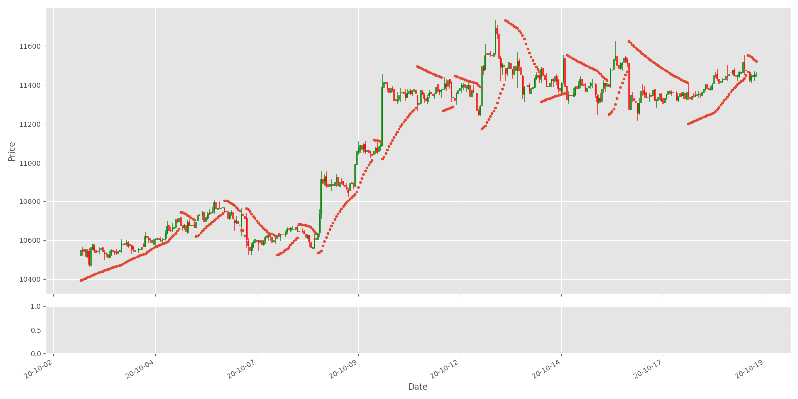
The above chart shows that the indicator works well for capturing profits during a trend, but it can lead to many false signals when the price moves sideways or is trading in a choppy market. The indicator shows that the best idea is to keep order in an open position while the price rises. Once the market starts moving sideways, the investor ought to expect additional losses and/or tiny profits.
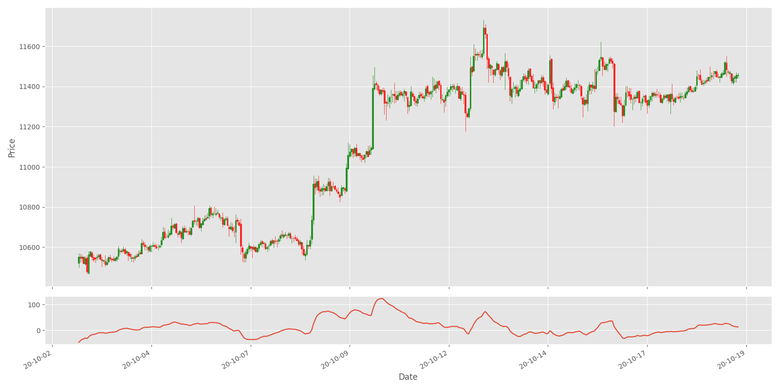
Moving Average Convergence Divergence (MACD)
Moving average convergence divergence (MACD) is a trend-following momentum indicator that shows the correlation between 2 moving averages of a market's price. Default MACD is calculated by subtracting the 26-period exponential moving average (EMA) from the 12-period EMA.
As a result of this mentioned calculation, we receive the MACD line. A nine-day EMA of the MACD is the "signal line," which is plotted on top of the MACD line, which might operate as a trigger for buy and sell signals. Traders may do a buy order once the MACD crosses above its signal line and sell - or short - the security once the MACD crosses below the signal line. Moving average convergence divergence (MACD) indicators are often interpreted in several ways. However, the most common methods are divergences, crossovers, and fast rises/falls.
- MACD is calculated by subtracting the 26-period exponential moving average (EMA) from the 12-period EMA.
- MACD triggers technical signals once it crosses above (to buy) or below (to sell) its signal line;
- The speed of crossovers is additionally taken as an indication that a market is overbought or oversold;
- MACD helps investors perceive whether or not the optimistic or pessimistic movement within the price is strengthening or weakening.
There is a lot of ways how MACD can help us while doing market orders. Different from the indicators mentioned above, MACD will be plotted to volume subplot because it has different ranges while calculated, and we can't plot in the price subplot. We'll use the following code:
import pandas as pd
from ta.trend import macd

def AddIndicators(df):
    # Add Moving Average Convergence Divergence (MACD) indicator
    df["MACD"] = macd(close=df["Close"], window_slow=26, window_fast=12, fillna=True)

    return df

if __name__ == "__main__":
    df = pd.read_csv('./pricedata.csv')
    df = df.sort_values('Date')
    df = AddIndicators(df)

    test_df = df[-400:]

    # Add Moving Average Convergence Divergence
    Plot_OHCL(test_df, ax2_indicators=["MACD"])
This indicator won't look as informative as previous were, but our Neural Networks will find it out by itself:
Relative Strength Index (RSI)
The relative strength index (RSI) is a momentum indicator employed in a technical analysis that measures the magnitude of recent market changes to estimate overbought or oversold conditions within the current market price. The RSI is displayed as an oscillator (a line graph that moves between 2 extremes) and might read between 0–100. The indicator was originally developed by J. Welles Wilder Junior. and introduced in his seminal 1978 book, "New Concepts in Technical Trading Systems." Traditional interpretation and usage of the RSI measure that values of >70 indicate that a security is turning overbought or overvalued and will be set for a trend reversal or corrective pullback in its value. The reading 30< indicates the oversold or undervalued condition
- RSI is a viral and known momentum oscillator indicator developed in 1978;
- The RSI provides technical traders signals concerning optimistic and pessimistic market momentum, and it is often plotted to a lower place of the price graph;
- An asset is usually considered overbought once the RSI is above 70% and oversold below 30%.
This is the last indicator we'll use with our trader, and it's similarly simple to plot this indicator as before:
import pandas as pd
from ta.momentum import rsi

def AddIndicators(df):
    # Add Relative Strength Index (RSI) indicator
    df["RSI"] = rsi(close=df["Close"], window=14, fillna=True)

    return df

if __name__ == "__main__":
    df = pd.read_csv('./pricedata.csv')
    df = df.sort_values('Date')
    df = AddIndicators(df)

    test_df = df[-400:]

    # Add Relative Strength Index
    Plot_OHCL(test_df, ax2_indicators=["RSI"])
The above code will give us the following results:

As you can see in the above chart, the RSI indicator can stay in the overbought (> 70%) region for extended periods while the stock is in an uptrend. The indicator may also remain in oversold (< 30%) territory for a long time when the stock is in the downtrend.
This is a short introduction to these five indicators, there is much more that could be told about them, but I don't want to expand to this because we won't make these trades. We want to teach our Reinforcement Learning agents to do them profitably.
Up to this moment, we covered all five indicators one by one, but we won't use these indicators separately. We'll process these indicators together with our market information and order information. We'll send all this data to our Bitcoin Reinforcement Learning agent to decide what action it should take. But before doing that, let's look at how our indicators look when they all are plotted into one chart.
To plot this graph, I wrote a new function called Plot_OHCL which I inserted into utils.py, but for the main plotting, I wrote another script called indicators.py that we may use to plot all our indicators one plot with OHCL bars.
This is our Plot_OHCL function in utils.py script plotting function:
import matplotlib.pyplot as plt
from mplfinance.original_flavor import candlestick_ohlc
import matplotlib.dates as mpl_dates

def Plot_OHCL(df):
    df_original = df.copy()
    # necessary convert to datetime
    df["Date"] = pd.to_datetime(df.Date)
    df["Date"] = df["Date"].apply(mpl_dates.date2num)

    df = df[['Date', 'Open', 'High', 'Low', 'Close', 'Volume']]

    # We are using the style ‘ggplot’
    plt.style.use('ggplot')

    # figsize attribute allows us to specify the width and height of a figure in unit inches
    fig = plt.figure(figsize=(16,8))

    # Create top subplot for price axis
    ax1 = plt.subplot2grid((6,1), (0,0), rowspan=5, colspan=1)

    # Create bottom subplot for volume which shares its x-axis
    ax2 = plt.subplot2grid((6,1), (5,0), rowspan=1, colspan=1, sharex=ax1)

    candlestick_ohlc(ax1, df.values, width=0.8/24, colorup='green', colordown='red', alpha=0.8)
    ax1.set_ylabel('Price', fontsize=12)
    plt.xlabel('Date')
    plt.xticks(rotation=45)

    # Add Simple Moving Average
    ax1.plot(df["Date"], df_original['sma7'],'-')
    ax1.plot(df["Date"], df_original['sma25'],'-')
    ax1.plot(df["Date"], df_original['sma99'],'-')

    # Add Bollinger Bands
    ax1.plot(df["Date"], df_original['bb_bbm'],'-')
    ax1.plot(df["Date"], df_original['bb_bbh'],'-')
    ax1.plot(df["Date"], df_original['bb_bbl'],'-')

    # Add Parabolic Stop and Reverse
    ax1.plot(df["Date"], df_original['psar'],'.')

    # # Add Moving Average Convergence Divergence
    ax2.plot(df["Date"], df_original['MACD'],'-')

    # # Add Relative Strength Index
    ax2.plot(df["Date"], df_original['RSI'],'-')

    # beautify the x-labels (Our Date format)
    ax1.xaxis.set_major_formatter(mpl_dates.DateFormatter('%y-%m-%d'))# %H:%M:%S'))
    fig.autofmt_xdate()
    fig.tight_layout()

    plt.show()
And this is our main code to plot indicators:
import pandas as pd
from ta.trend import SMAIndicator, macd, PSARIndicator
from ta.volatility import BollingerBands
from ta.momentum import rsi
from utils import Plot_OHCL

def AddIndicators(df):
    # Add Simple Moving Average (SMA) indicators
    df["sma7"] = SMAIndicator(close=df["Close"], window=7, fillna=True).sma_indicator()
    df["sma25"] = SMAIndicator(close=df["Close"], window=25, fillna=True).sma_indicator()
    df["sma99"] = SMAIndicator(close=df["Close"], window=99, fillna=True).sma_indicator()

    # Add Bollinger Bands indicator
    indicator_bb = BollingerBands(close=df["Close"], window=20, window_dev=2)
    df['bb_bbm'] = indicator_bb.bollinger_mavg()
    df['bb_bbh'] = indicator_bb.bollinger_hband()
    df['bb_bbl'] = indicator_bb.bollinger_lband()

    # Add Parabolic Stop and Reverse (Parabolic SAR) indicator
    indicator_psar = PSARIndicator(high=df["High"], low=df["Low"], close=df["Close"], step=0.02, max_step=2, fillna=True)
    df['psar'] = indicator_psar.psar()

    # Add Moving Average Convergence Divergence (MACD) indicator
    df["MACD"] = macd(close=df["Close"], window_slow=26, window_fast=12, fillna=True) # mazas

    # Add Relative Strength Index (RSI) indicator
    df["RSI"] = rsi(close=df["Close"], window=14, fillna=True) # mazas

    return df

if __name__ == "__main__":
    df = pd.read_csv('./pricedata.csv')
    df = df.sort_values('Date')
    df = AddIndicators(df)

    test_df = df[-400:]

    Plot_OHCL(test_df)
After it runs without any errors you should see the following chart:
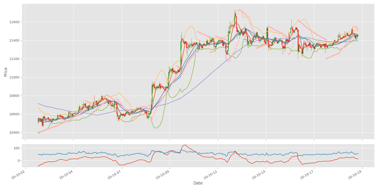
Now you can see the result while combining all indicators we covered into one chart. It can be assumed that it is possible to discover a correlation between the indicators and the price change. If our bot makes more profit than in the previous tutorial, we can assume that these indicators are helpful to use. However, if we aren't experienced traders, we are probably still going to lose our money in the long term. So, we'll send this technical information to our Neural Networks to find a purposeful correlation in between.
Implementing indicators to our RL agent code
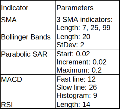
We already covered how to implement these indicators into our dataset and how we can visualize them. We do all the same steps with Open, High, Close, etc., numbers. So, we shortly covered five indicators with nine parameters: three by SMA, three by Bollinger Bands, and one by each of PSAR, MACD, RSI indicators. This means that we need to modify our model input state, before it had ten input features, right now there will be 10+9 features:
self.state_size = (lookback_window_size, 10)
we change to ->
self.state_size = (lookback_window_size, 10+9)
Because these indicators are already calculated and inserted into our data frame, it's pretty simple to use them. Mainly we need to modify the reset and _next_observation functions from CustomEnv class.
At the __init__ place, we define a new deque list:
self.indicators_history = deque(maxlen=self.lookback_window_size)
Where we'll store our indicators information from every step. Before we were processing only self.market_history information and then concatenating it with self.orders_history, now we need to add self.indicators_history to the whole process.
We modify our reset function to the following:
for i in reversed(range(self.lookback_window_size)):
    current_step = self.current_step - i
    self.orders_history.append([self.balance, self.net_worth, self.crypto_bought, self.crypto_sold, self.crypto_held])

    self.market_history.append([self.df.loc[current_step, 'Open'],
                                self.df.loc[current_step, 'High'],
                                self.df.loc[current_step, 'Low'],
                                self.df.loc[current_step, 'Close'],
                                self.df.loc[current_step, 'Volume'],
                                ])

    self.indicators_history.append(
        [self.df.loc[current_step, 'sma7'] / self.normalize_value,
                                self.df.loc[current_step, 'sma25'] / self.normalize_value,
                                self.df.loc[current_step, 'sma99'] / self.normalize_value,
                                self.df.loc[current_step, 'bb_bbm'] / self.normalize_value,
                                self.df.loc[current_step, 'bb_bbh'] / self.normalize_value,
                                self.df.loc[current_step, 'bb_bbl'] / self.normalize_value,
                                self.df.loc[current_step, 'psar'] / self.normalize_value,
                                self.df.loc[current_step, 'MACD'] / 400,
                                self.df.loc[current_step, 'RSI'] / 100
                                ])

state = np.concatenate((self.market_history, self.orders_history), axis=1) / self.normalize_value
state = np.concatenate((state, self.indicators_history), axis=1)

return state
And also, we need to modify our _next_observation function:
# Get the data points for the given current_step
def _next_observation(self):
    self.market_history.append([self.df.loc[self.current_step, 'Open'],
                                self.df.loc[self.current_step, 'High'],
                                self.df.loc[self.current_step, 'Low'],
                                self.df.loc[self.current_step, 'Close'],
                                self.df.loc[self.current_step, 'Volume'],
                                ])

    self.indicators_history.append([self.df.loc[self.current_step, 'sma7'] / self.normalize_value,
                                self.df.loc[self.current_step, 'sma25'] / self.normalize_value,
                                self.df.loc[self.current_step, 'sma99'] / self.normalize_value,
                                self.df.loc[self.current_step, 'bb_bbm'] / self.normalize_value,
                                self.df.loc[self.current_step, 'bb_bbh'] / self.normalize_value,
                                self.df.loc[self.current_step, 'bb_bbl'] / self.normalize_value,
                                self.df.loc[self.current_step, 'psar'] / self.normalize_value,
                                self.df.loc[self.current_step, 'MACD'] / 400,
                                self.df.loc[self.current_step, 'RSI'] / 100
                                ])

    obs = np.concatenate((self.market_history, self.orders_history), axis=1) / self.normalize_value
    obs = np.concatenate((obs, self.indicators_history), axis=1)

return obs
While seeing this code should raise one question for you: why in two lines instead of dividing by self.normalize_value I divide by 400 and 100. It is simpler to show you the answer visually than to explain.
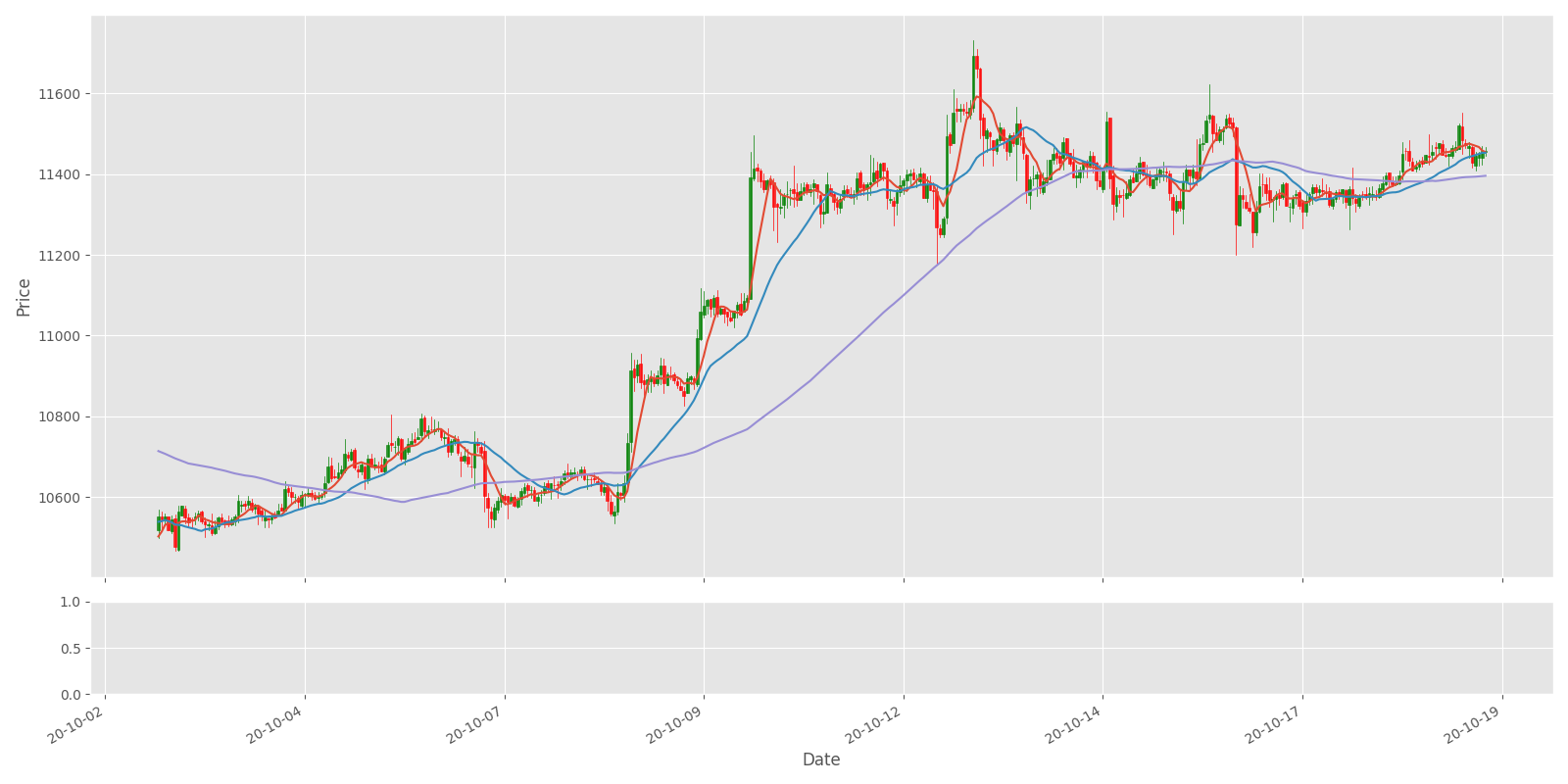
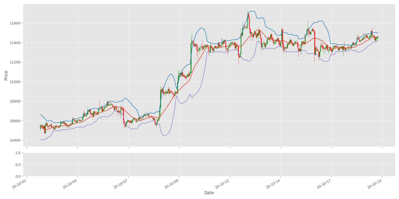
If you ran indicators.py script for the entire dataset, you would see the following graphs:
.png)
Although the graph seems significantly compressed since it contains a lot of timeframes, looking at the bottom subplot, you might see that our MACD curve has a maximum and minimum pikes between +-300, and our RSI fluctuates between 0–100. I chose to normalize these values by dividing them by 400 and 100, respectively.
Training and Testing our model
Unlike my previous tutorial, where we tested the best model architecture (Dense, CNN, or LSTM), now we don't need to test between all these models. We will train the same Dense model with the same parameters and for the same amount of training steps. After the training, we will compare the results obtained while running this model to the same unseen test dataset:
from indicators import AddIndicators
if __name__ == "__main__":
    df = pd.read_csv('./pricedata.csv')
    df = df.sort_values('Date')
    df = AddIndicators(df) # insert indicators to df

    lookback_window_size = 50
    test_window = 720 # 30 days
    train_df = df[:-test_window-lookback_window_size]
    test_df = df[-test_window-lookback_window_size:]

    agent = CustomAgent(lookback_window_size=lookback_window_size, lr=0.00001, epochs=5, optimizer=Adam, batch_size = 32, model="Dense")
    train_env = CustomEnv(train_df, lookback_window_size=lookback_window_size)
    train_agent(train_env, agent, visualize=False, train_episodes=50000, training_batch_size=500)

    #test_env = CustomEnv(test_df, lookback_window_size=lookback_window_size, Show_reward=False, Show_indicators=False)
    #test_agent(test_env, agent, visualize=False, test_episodes=10, folder="", name="", comment="")
As you can see, this code part doesn't change. Except that we need to import the AddIndicators function, which we call in the 5th line of code to process the whole dataset, other training steps are all the same.
I used the following parameters to train our model:
training start: 2021-01-18 22:18
initial_balance: 1000
training episodes: 50000
lookback_window_size: 50
lr: 1e-05
epochs: 5
batch size: 32
normalize_value: 40000
model: Dense
training end: 2021-01-19 14:20
As you can see, the parameters are quite the same as in my series of previous tutorials, and as a result, our training took around 16 hours. But actually, we are here not about the training part, but testing, so I ran the following code to test our trained model:
if __name__ == "__main__":
    df = pd.read_csv('./pricedata.csv')
    df = df.sort_values('Date')
    df = AddIndicators(df) # insert indicators to df

    lookback_window_size = 50
    test_window = 720 # 30 days
    train_df = df[:-test_window-lookback_window_size]
    test_df = df[-test_window-lookback_window_size:]

    agent = CustomAgent(lookback_window_size=lookback_window_size, lr=0.00001, epochs=5, optimizer=Adam, batch_size = 32, model="Dense")
    test_env = CustomEnv(test_df, lookback_window_size=lookback_window_size, Show_reward=False, Show_indicators=False)
    test_agent(test_env, agent, visualize=False, test_episodes=1000, folder="2021_01_18_22_18_Crypto_trader", name="1933.71_Crypto_trader", comment="")
After running the above code to test our Bitcoin trading bot against an unseen test dataset, we received pretty satisfying results:
test episodes: 1000
net worth: 1078.6216040753616,
orders per episode: 135.945
no profit episodes: 1
comment: Dense network
If we would compare these results with the previous tutorial following results:
net worth: 1054.483903083776
orders per episode: 140.566
no profit episodes: 14
We can see that we have better results. It doesn't matter that the bot makes fewer orders per episode, but it makes 2% more profit than before, and most importantly, it had only one episode that finished in negative net worth.
In summary, our bot made close to 8% profit from unseen data while trading Bitcoin in perfect conditions; that's fantastic results!
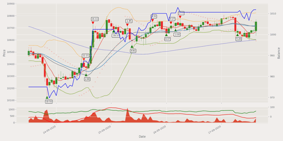
If we would like to see what orders our bot makes with all the indicators, etc., we should change the following Show_reward=True, Show_indicators=True, visualize=True parameters, and while running our same testing code, we may see similar results:
Conclusion:
Currently, we can see that our Bitcoin trading agent shows some positive results that we can achieve. Of course, there is still much that could be done to improve the performance of these agents. However, this requires a lot of effort and time to develop and do experiments with these changes. Every new tutorial on this topic takes more and more of my time, and there is nothing I can do. The only motivation is to see positive results, and I have proved that Artificial Intelligence can be used while trading Bitcoin profitably! Including this tutorial and previous ones we had in the past, we defeated a lot of challenges.
Up to this point, during all previous tutorials, we were training and testing our agents within the same historical data. Still, I think everyone is interested in how this bot would perform with more training data and the current Bitcoin price? So to solve this, I felt that in the next tutorial, I'd write about downloading historical data from the Cryptocurrency market and do the training!
Because we'll have much more training data, we may face a problem that our training may take days to train. So I'll try to solve this so we can run multiple simulated trading environments at once (for example, 16 environments) to spend less time while training. More about in the next tutorial, see you there!
Thanks for reading! There is still a lot of work to do. Subscribe and like my video on YouTube, share this tutorial, and you'll be notified when another tutorial will see the daylight! As always, all the code given in this tutorial can be found on my GitHub page and is free to use! See you in the next part.
All of these tutorials are for educational purposes and should not be taken as trading advice. It would be best to not trade based on any algorithms or strategies defined in this, previous, or future tutorials, as you are likely to lose your investment.